

Above-the-Fold Best Practices for Vet Landing Pages start with making the clinic, location, service and next action obvious within the first few seconds. When a pet owner arrives on a landing page, they should quickly understand whether your veterinary clinic can help, where you are located and whether they should book an appointment, call the clinic or follow an emergency pathway.
The First Five Seconds Define the Job of the Landing Page
The first screen should establish relevance quickly because landing page visitors often arrive with a specific need. Someone searching for a local vet, vaccination appointment, dental procedure or urgent consultation should not have to read the entire landing page before understanding what the clinic offers. This is one of the most useful landing page best practices for veterinary clinics because it gives the page a clear conversion goal. Rather than trying to explain the entire practice above the fold, concentrate on the key elements that help potential customers decide whether to continue, call or book.
Get a Customized Marketing Strategy for Your Business
Schedule a free consultation to discuss how our digital marketing solutions can help you reach more customers.
Start With a Clear and Compelling Headline
Once the purpose of the page is clear, the headline should confirm that the visitor has reached the right place. A clear and compelling headline normally works best when it combines the service, location or main reason someone would choose that particular page. For example, “Veterinary Care for Dogs and Cats in Belconnen” communicates more than a broad statement such as “Care You Can Trust”. The first version gives visitors a clear value proposition by explaining what the clinic does and where it operates, while the second leaves them to search for those details elsewhere.
A compelling headline should generally:
Describe the service in simple terms
Reflect the visitor's likely search intent
Include location where appropriate
Speak directly to the target audience
Connect naturally with the primary CTA
The supporting text underneath can then explain the value proposition in one or two short sentences. For a vet clinic, that may include the types of animals treated, appointment availability or a practical feature of the service rather than broad statements about being the best clinic.
Put The Booking Path Before the Brand Story
After confirming relevance, the landing page should make the next action easy to find. Converting landing pages reduce unnecessary steps between the visitor arriving and completing the primary action, particularly when that person has already searched for a specific veterinary service. For routine veterinary services, the main call to action CTA will usually be an appointment booking option. A secondary action can provide a telephone number, while urgent or after-hours situations should have a clearly separated pathway, so visitors do not mistake a routine booking form for emergency contact.
The wording should describe what happens after the visitor clicks. Generic buttons such as “Continue” or “Learn More” provide less context than a clear call to action such as “Book A Vet Appointment”.
Use Visual Hierarchy to Make Information Easy to Scan
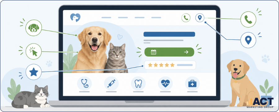
With the headline and CTA established, the next part of landing page design is deciding which information deserves the most visual attention. Visual hierarchy simply means arranging text, buttons, images and supporting details so visitors naturally notice the most important information first. A good landing page does not give every element the same size or prominence. The headline should immediately grab attention without becoming oversized, the CTA should be easy to distinguish, and practical information such as location or opening hours should remain visible without competing with the main conversion goal.
White space helps separate important information rather than forcing every available message into the first screen. High-quality visuals can support a strong landing page, but they should not push booking information or contact details below the fold.
Make Service, Location and Availability Clear
Once the basic page layout is working, practical information should remove uncertainty. A pet owner deciding between several clinics may care just as much about location, opening hours and appointment availability as they do about the clinic's broader brand message. This is particularly important for search traffic because a visitor may have searched using a suburb, service or time-sensitive phrase. An effective landing page should make it easy to work out whether the clinic matches that need without requiring the visitor to navigate multiple pages. Useful practical information includes:
Clinic suburb or service area
Current opening hours
Appointment booking options
Phone contact information
Emergency or after-hours instructions
For a broader view of changing search behaviour, local visibility and optimisation priorities, read our guide to SEO Trends Vet Clinics in Australia Should Watch.
Design for Mobile Devices Before Adding More Content
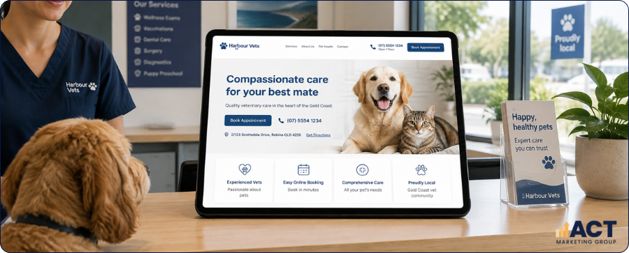
Once the information hierarchy works, review how the page performs on mobile devices. Pet owners may be searching while travelling, sitting with an unwell animal or comparing nearby practices, so the mobile landing page should make essential information accessible without unnecessary zooming, scrolling or menu navigation. Page speed matters here because high-quality images, video backgrounds and unnecessary interactive elements can make an otherwise good landing page slower to use. Whether you create landing pages through a custom build, landing page templates or a drag and drop builder, the finished page should still be tested on actual mobile devices.
For mobile landing page performance, check that:
The headline remains easy to read
The primary CTA appears early
Phone numbers are tap-to-call
Images are appropriately sized
Forms are short and practical
Match The Landing Page to the Visitor's Search Intent
Successful landing pages normally perform one clear job, which means a page created for a vaccination campaign should not be identical to a general veterinary homepage or emergency-care page. This is especially relevant when working with search engine optimization, Google Ads or other paid ads. Ad traffic searching for one service should usually arrive on a standalone page that speaks directly to that need rather than a broad homepage where the visitor must locate the information themselves. If your veterinary clinic uses paid search, read our guide to Google Ads Updates Vet Clinics in Australia Need To Know for practical guidance on campaign structure, conversion tracking and keeping ad traffic aligned with real booking intent.
Creating multiple pages can make sense when each one addresses a distinct service or audience's pain points. It should not mean publishing several near-identical pages solely to target additional keywords, because each page still needs a useful purpose for visitors.
Build Credibility Without Overloading the First Screen
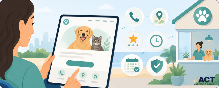
Once visitors understand the service and next step, supporting trust signals can reduce uncertainty. For veterinary clinics, this may include identifiable veterinary professionals, factual information about clinic facilities, recognised qualifications, years operating in the local area or clear explanations of the types of animals and services the practice handles. Social proof may help build credibility in some settings, but it should not replace practical information or dominate the page. Any customer testimonials or third-party comments used in marketing should be genuine, appropriately presented and reviewed against the professional and advertising requirements relevant to the clinic.
Useful credibility elements may include:
Genuine clinic or team photographs
Veterinarian names and professional roles
Relevant facilities and services
Clear pricing information where appropriate
Current professional affiliations
Consistent branding also matters, particularly when visitors move from search engines or paid ads to the landing page. The wording, service offer and visual presentation should feel connected, so visitors are not left wondering whether they reached the right clinic.
Remove Distractions That Compete with the Conversion Goal
After the essential information is in place, review what can be removed. Many landing pages become difficult to use because large menus, promotional banners, rotating images, multiple CTAs and lengthy introductory copy all compete for attention. High-converting pages are generally easier to understand when each section has a defined purpose. The entire landing page can still contain detailed service information and supporting content, but the first screen should stay focused on helping the visitor understand the service and take the next appropriate action.
Keep The Rest of the Page Focused on the Same Decision
Once a visitor scrolls, the rest of the page should continue the argument established above the fold. If the first screen promises information about a particular veterinary service, the next sections should explain that service, clarify suitability, answer likely concerns and give the visitor another clear opportunity to act. The entire landing page should feel connected rather than becoming a collection of unrelated SEO sections. That consistency is particularly important when building landing pages for generating leads because every section should support the same visitor need instead of introducing unnecessary detours.
Bullet points can make practical information easier to scan, but they should support the explanation rather than replace it. A great landing page still needs enough context for visitors to make an informed decision.
Have Questions?
We're Here to Help!
Measure Landing Page Performance Against Real Actions
Once the landing page is live, its success should be measured against meaningful visitor actions rather than appearance alone. A high-performing landing page is one that supports the right people in completing the intended action, whether that is an appointment booking, phone call, enquiry or request for directions. Google Analytics or another analytics platform can help you understand user behavior across the entire page. Useful measures include conversion rate, booking-button clicks, phone clicks, form completions and scroll depth, particularly when compared across mobile traffic, search traffic and paid ad traffic.
Conversion rate should be treated as a diagnostic measure rather than a score that exists on its own. A page can attract fewer visitors but still produce more useful enquiries if the content better matches the target audience and their reason for searching.
Improve Landing Page Performance One Change at a Time
Once you have baseline data, avoid changing the entire landing page at once. Making one meaningful change at a time makes it easier to understand whether the headline, CTA, page layout, image choice or supporting copy affected landing page conversions. The same principle applies when looking for more conversions from search engine optimization or paid ads. A landing page's success depends on the relationship between traffic quality, visitor expectations and the page itself, so improving performance requires more than simply changing button colours or adding more promotional language.
Useful elements to test include:
The main headline
CTA wording
Hero image choice
Form length
Placement of practical information
Review each change against actual user behavior. The objective is to make the page easier to understand and use, not to produce a more aggressive version of the same sales message.
Improve Your Vet Landing Page Above the Fold
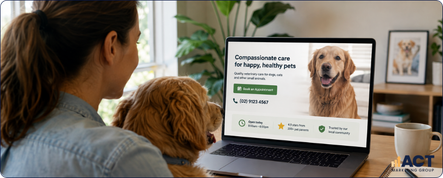
The best practices for high converting landing pages are useful for veterinary clinics because they force clear priorities. Your first screen should identify the service and location, provide a compelling headline, explain the clear value proposition and make the most appropriate next action easy to find. From there, the rest of the landing page should support that initial decision with useful service information, practical details, credibility signals and a straightforward booking pathway. Rather than trying to create a high converting landing page by adding more promotional copy, focus on making every part of the page useful to a pet owner deciding what to do next.
Start by opening one of your main veterinary landing pages on a mobile phone and viewing it as a new visitor. Check whether the service, location, booking option, phone number and appropriate urgent-care pathway can be identified within a few seconds. A strong landing page is ultimately built around clarity rather than exaggeration. When your landing page speaks directly to pet owners, reflects their immediate needs and provides a clear next step, it is better placed to support both search visibility and practical conversion outcomes.